
ALICE
My work evolves around my perspective of gender roles. I am inspired by my personal experience and differentiated culture of the environment. My artworks first consider the beauty standards of modern society, and then explores stereotypes of the mother’s conventional role in households. I hope that my exhibition can allow my audience to realize that female gender acquires connotation of cultural or attitudinal and emotional characteristics, as opposed to physical appearance – an encouraging and truthful journey via the hidden emotional intentions of female sacrifice and experience.
Given the space available, my exhibition starts with three artworks that fit in the series of “Beauty”, which illustrate the extreme standards of physical appearance created by society. “Beauty Standards” is a clay sculpture I placed on a large block by my first panel. I want the viewer to be introduced to “Beauty” by first looking at an undefined gender and societal roles.
I continue with “Identity” and “Curves”, a painting and a drawing respectively. Similar with “Beauty Standards”, both artworks focus on physical appearance, establishing their common theme as “Beauty.” Both include gestural lines throughout the human figures, and the warm reddish tones contrast with the clean white panels. The numerous gestural lines not only make them stand out when they are right next to each other but also allow the sculpture “Beauty Standard’s” simplicity to display more clearly.
I then place three illustrations side by side. They explore the theme of “Mother’s duty.” Two illustrations, “The Pattern of Her Clothes” and “Snail Mother,” focus on my mother’s routine at home, illustrating the protection and care that a mother provides for a household on a daily basis. While “Dreaming of Nature” introduces my mom’s values of reaching for freedom and seeking a love for nature outside the house. The drawing overwhelms the audience with its big size, which contrasts with the other illustrations and their dark color scheme. The arrangement of these three pieces allows the viewer to acknowledge the common idea of the dull duties mothers are forced to carry out in routines. Thus, touching the audience in an emotional way and leading the audience towards the last two pieces on the white panel.
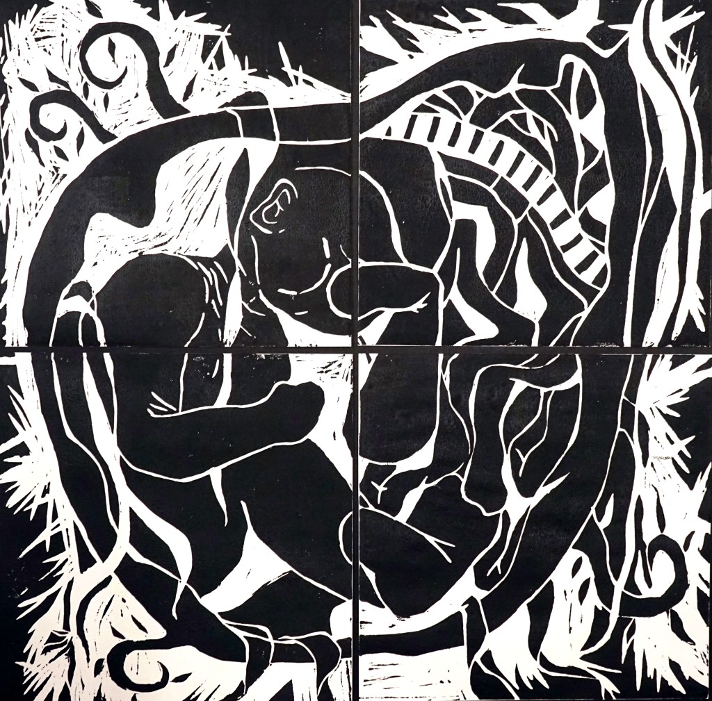
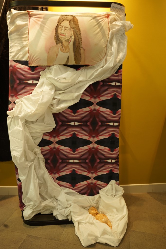
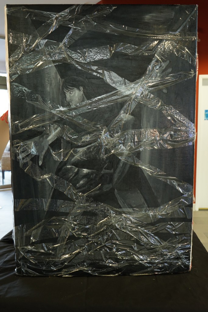
The display panels end with a mixed media piece “Inside the Womb” and a linoleum ink print “Awareness of Smoking for Childbirth”, that explores the theme of “Perils of Mothers.” Continuing the theme of “Perils of Mothers”, parallel to the linoleum block, a bed installation “Mother’s Childbirth” hangs on the wall. I originally thought it may be a bed laying down as it normally appears. I found, however, that hanging it was much more powerful for the viewer. The pillow stitched with a face is now in front of the viewer’s gaze and much more impactful to look at. The drape of the sheet cascades down the length of the bed and leads the viewer’s eye to the miscarried baby. By hanging this piece on the wall, I feel like the scale becomes more overwhelming.
The last two pieces are on each side of “Mother’s Childbirth”. A tree installation “The Growth” is on the left, and an oil painting “Traditional Advertisement” is on the right side of the wall. Both artworks are inspired by feminist artists exploring the theme of gender roles in the past and in modern society. Both the installation and the painting are at each end of the given space and let the viewers feel surrounded.
My overall visual of displaying the artworks creates an encouraging and optimistic journey, so both genders of my audience can recall the powerless female gender of the past and present sometimes in current society. I intend to provide an urgency to make a difference and eliminate the division between female and male genders. The artworks begin in front of the wall and end at the same space in a circular shape, with my first clay sculpture and my last piece in oil painting. All my artworks evolve around gender roles and female duties; I want my audience to be overwhelmed with different dynamics of colors and assorted sizes of works while walking through, with curiosity of how to be equal in opportunities and resources regardless of gender.


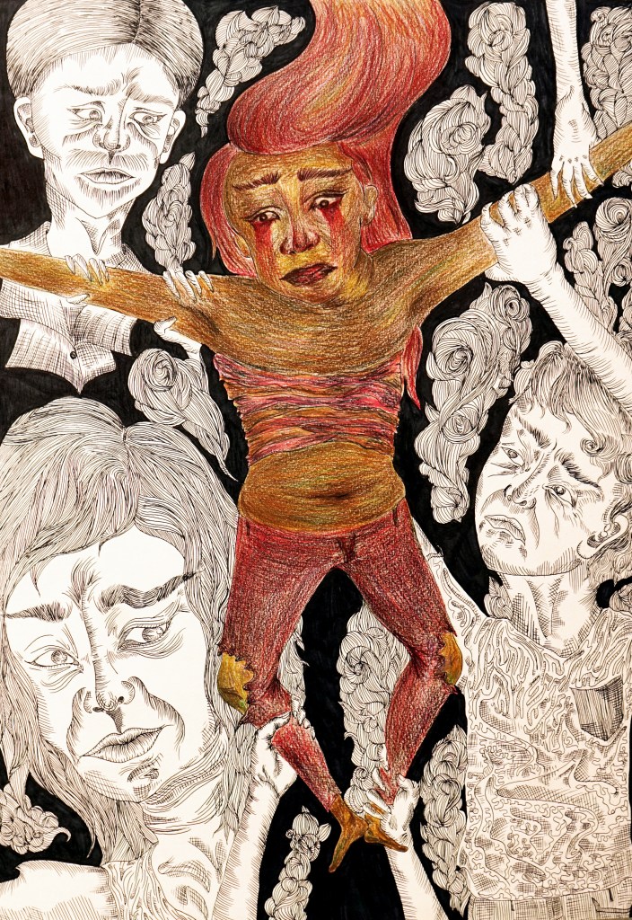
Inspired by Max Beckmann. The interior of my artwork presents the social issues
that transgenders go through in the US society. It mainly focuses on color symbolism
and gestural lines within the human figures. Black and white symbolizes the negative
pressure of the society towards an individual. The red tears expresses the pain of the
LGBTQ community. The ridiculed ratio of the transgender symbolizes their flexible and
unstable emotions caused by their surroundings.
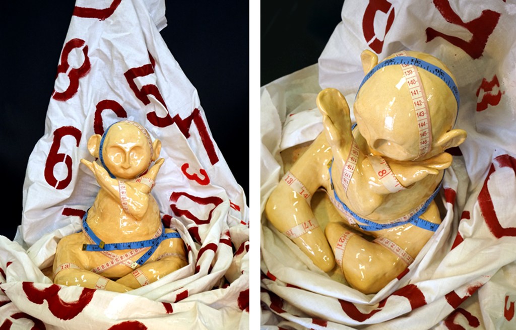
Inspired by Constantin Brancusi, the intention of this clay sculpture is to convey
the idea that beauty standards in our environment should not influence a human being’s self- esteem and confidence. I simplified the face and body (as did Brancusi) to break the correlation between one’s physical look and one’s behavior. The red numbers on the cloth symbolize the reality of our society; physical appearance and how higher social status leads to one’s confidence.

Inspired by Jenny Savile, the intention of this oil painting is to express the natural
and inner beauty of a woman to convey the idea that there shouldn’t be an extreme
beauty standard in modern society. The woman faces down with limited clothes on her
body. This symbolizes the strict rules that she has to follow to keep up with the high ends in the society. The blurred face expresses a woman’s fear and her alarmed
emotions of being judged of her physical appearance.
Inspired by Butcher Billy, this illustration focuses on my mother’s routine at home.
The background pattern resembles her clothing and symbolizes the care and effort that
she puts into our household and myself. It also generalizes the stereotypical duty that
females are forced to succeed inside a household. Through her emotionless
expression, it illustrates a mother’s strong mentality and sacrifice for a family.
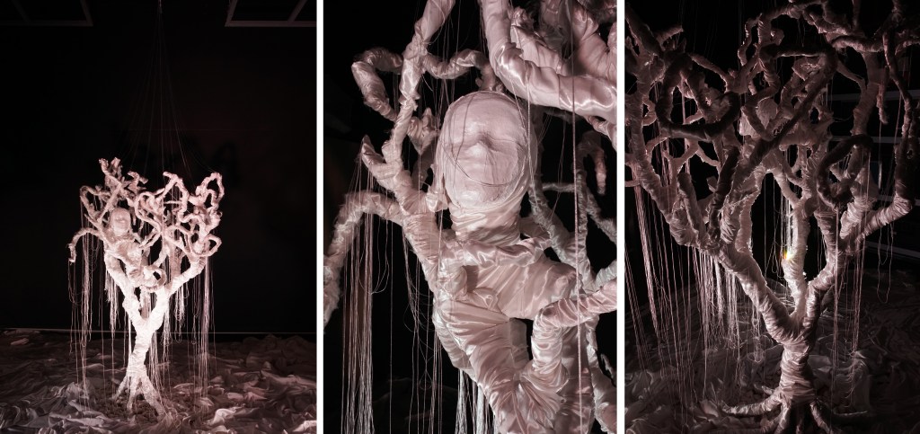
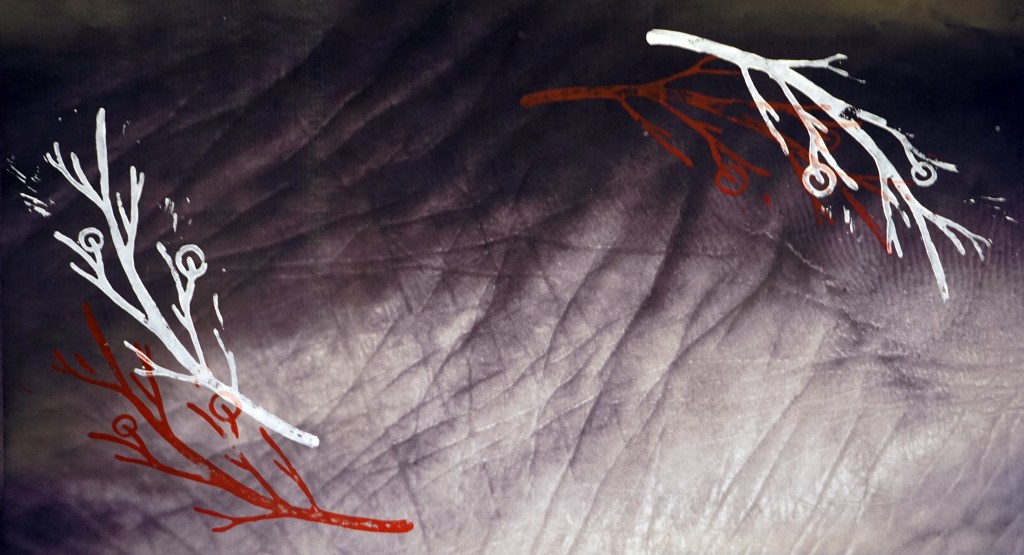
“The Growth”
Inspired by Lin Tianmiao, the purpose of this installation is to show my point of
view towards my mother’s infinite strength and love that she provides for me. It is also
how I interpret her effort and care within my universe and the connection that I have
with her; mentally and physically. The representation of the tree branches are
symbolism of my mother’s arm that are embracing myself as a growing teenager. While
threads symbolize the continuing journey of our relationship.
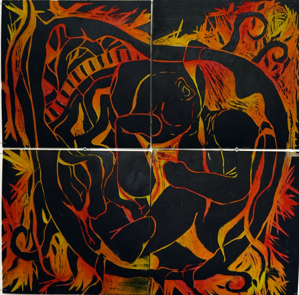
“Awareness of Smoking for Childbirth”
Inspired by Hannah Tompkins, this piece promotes the idea that there are still
pregnant women who can’t quit smoking while it is easily the number one cause of
adverse outcomes for babies. Deformed plants and the spikes around the womb
symbolize the negative impact of the chemicals. The side effects from cigarettes cause
problems with the placenta; the source of baby’s food and oxygen. Black and white
symbolize the growing risk factors of baby’s death.
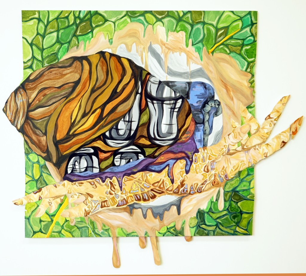
“Inside The Womb”
Inspired by Hannah Tompkins, this piece comments on the physical side effects on
babies from smoking. The hues red, orange and yellow symbolize the leading steps of
the baby’s physical pain due to lack of oxygen inside the womb {as the mother is
smoking}. The spikes surrounding the womb illustrate the growing possibility that the
mother would miscarry her child while the color black expresses the toxic influence of
the chemicals that spread inside the womb.
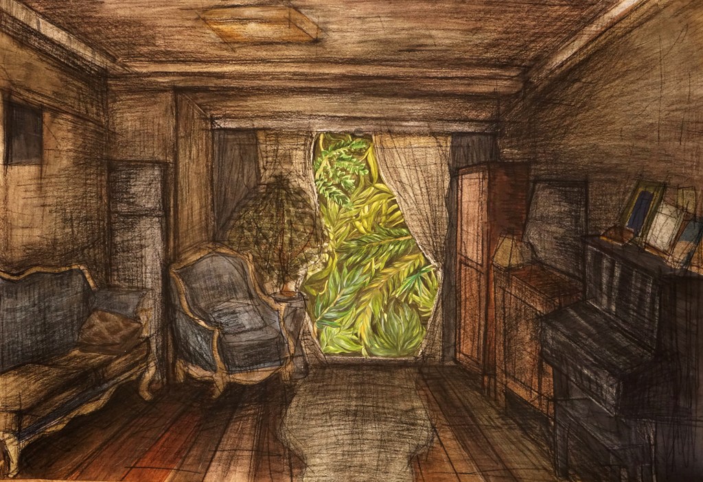
“Dreaming of Nature”
Inspired by Jean Albert, this piece focuses on a mother and daughter relationship.
From the mother’s perspective, she is willing to reach outside the house to nature,
where she seeks that love. I drew the small window to represent hard to reach caring. I
painted the room in a color harmony of various values of browns and grey and drew
gestural lines throughout the room. These colors and lines symbolize an atmosphere of
loneliness.
“Snail Mother”
Inspired by David Catrow, this illustration expresses a mother’s caring that
continuously develops for her child. The snail symbolizes a mother moving slowly, but
steadily, to reach their individual goals to become a proud mother. The pair of hands
symbolizes the protection and care that a mother provides on a daily bases. Snails in
the wild feed and rest on leaves inside their shell, thus I placed the snail on the
magnified leaf; her house is safe and protected.
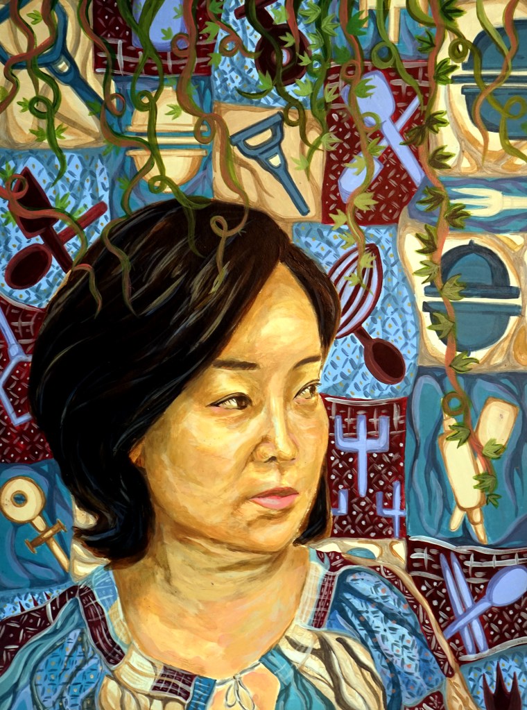
This piece comments on women’s traditional roles being outdated, misogynistic
and sexist. Inspired by Eva Hesse and 1950s American advertisements, my imagery
consists of kitchen tools seen in these ads. Women were traditionally seen as
housewives and depicted as such. I took kitchen items and painted them alone, to show the stereotype of women in the kitchen is outdated. I used plaster (as did Hess), to give the apron strings a 3D, abstract appearance as the concept of women’s roles
has changed.
“Mothers Childbirth”
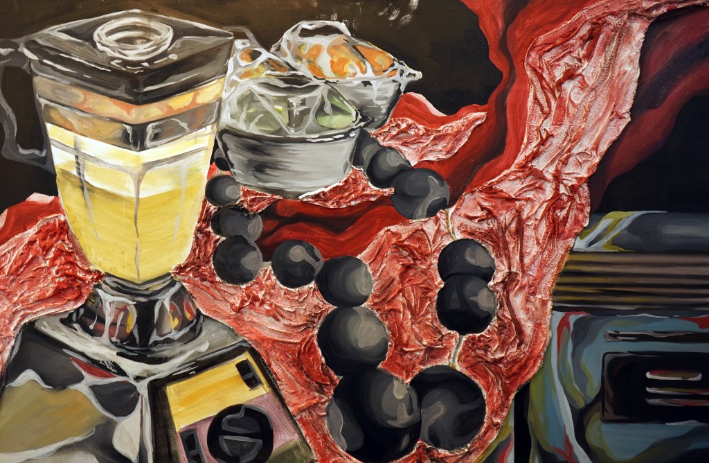
Inspired by Joetta Maue, I use a combination of photography and sculpture
commenting on a mother’s pain of having deformed babies and miscarriages. I used
Photoshop to create mirror images that resemble women’s bloody genitalia, symbolizing the lack of hospitality for women’s pregnancy in underdeveloped countries. The sewing on the pillow symbolizes a mother who suffered a miscarriage and the clay sculpture of the baby represents the lost child.
JULIE
The past plays a significant role in forming my current identity, as my childhood experiences molded me into the person that I am today. Physical health difficulties had affected my ability to comprehend the world around me, while specific interactions and support from those around had taught me to mature into a complex individual with a positive and strong mindset. This unique experience had inspired me to express myself in a creative manner which present my thoughts and feelings towards my childhood in visual form, thus allowing me to reconcile with emotions evoked by past memories.
My exhibition is prominently organized in regards to the order of events in my personal life. The theme of personal growth is first presented with the drawing “Best friends”, which introduces my struggles of battling against an immunity deficiency. This piece is partnered with the sculpture display “Head in the Clouds” to depict the importance of imagination and creativity in my childhood, as that was my “best friend” that helped me escape from the hardships of reality. The painting “Present” is also placed along with these two pieces to accompany the idea how I was grateful for my parents’ constant support and attempt in creating the most “normal” and happy childhood for me.
The viewer then follows these pieces in chronological order to arrive at three surrealist works that represent the final stages of my childhood, which was transformative phase. The pieces “Confined Happiness” and “Decisions” were significantly influenced by René Magritte, as both paintings depict indoor environments with surreal figures. The first piece comments on the struggles of adapting to new environments, while the second portrays the dilemma my parents faced which I was oblivious of until I had grown older. This transition allows the viewer to recognize a change in emotions, as the more lighthearted pieces foreshadowed and developed into a much darker time period. The use of dull colors presents an angst-filled atmosphere that juxtaposes with the bright and childish appearance of earlier pieces, as I had grown to realize that I was different from other children.
Further to the right of the panel, before entering the following phase of the exhibition, is the piece “Out of Reach”. The viewer is presented with a vivid-colored drawing of an underwater scene which symbolizes my search for freedom and being freed from my fear of social interactions. My nearsightedness was the main cause of most of my insecurities, and when I stopped wearing glasses, it allowed me to be more confident and also feel more connected with those around me. On the second display board, two series of works are displayed to project the first stages of my life as a teenager. The photography mix media series “Marks” comments on my acceptance towards natural appearances, which also marks my first step towards self-acceptance. The use of black and white colors contrasts with the red prints, which portrays an adolescent perspective that is more serious.
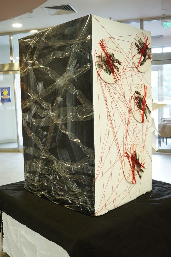
Following this piece is the screen-printed series “Lost and Found”, which illustrates the longingness I feel for my childhood despite the pain and struggles. The viewers are placed in front of a bulletin-like set up with poster prints that are in search for missing “childhoods”. This concept ironically presents how time is irreversible and is unable to be retrieved like lost belongings. Beside the posters is the installation piece “Us” created using an engraved wooden paint pallet, metal soldering and red strings. This piece depicts the bonds we create through human relationships, and how they can be broken yet recovered through reconnections. This presents a more interactive perspective to the core theme as the viewers are exposed to a more three-dimensional concept.
Lastly, the painting “Reflection” and the video art installation “Self. Control” are placed together to act as the finale of the overall exhibition. These pieces complete my life story as they present my current self as someone who is searching for their true identity and attempting to obtain control over my emotions and behaviours. The overall dark color scheme for both pieces and personal connections lead to a conclusion that my individuality will not only evolve based on what occurs on the past, but also the present.

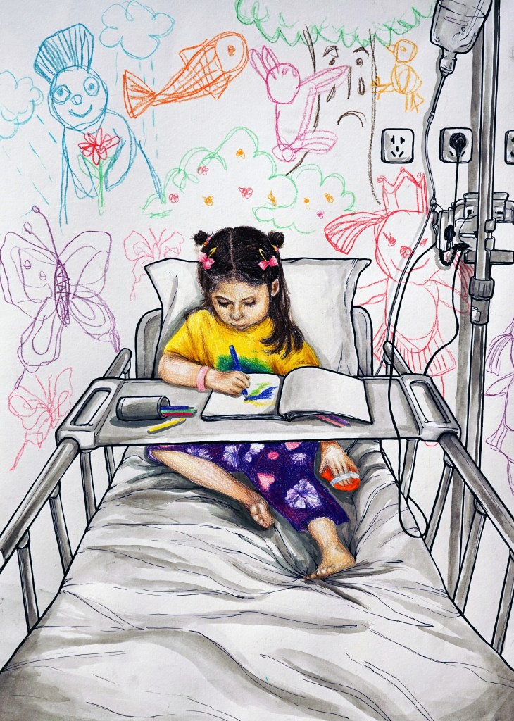
Inspired by David Hockney, this drawing captures my childhood memory of being hospitalized and often in isolation from other children. By using ink and color pencil, the contrast between monochromatic and vivid primary colors emphasizes the juxtaposition between the black and white world the main figure lives in and the imaginary world that she creates for herself through colorful doodles.
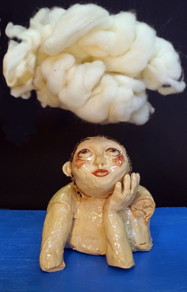
Inspired by Michelangelo’s cherub sculptures, this sculpture reflects the significance of imagination for me as a child and how that had helped me escape from the difficulties of the real world. The panel which the sculpture is attached to represents the rigid and harsh reality that she lives in, while the appearance of the child presents a sense of innocence and longing for freedom and she gazes upwards to the sky.

Inspired by Sandra Gamarra. My painting is based on a family photo from 2005. The video viewfinder captures the essence of how memories are often retrieved through photos and videos, while the time code represents that specific time period of my life. The reflection on the floor highlights and creates a focus for the main figure. This piece presents how grateful I am to have been able to live a normal childhood and experience the joy of something as simple as receiving Christmas presents.
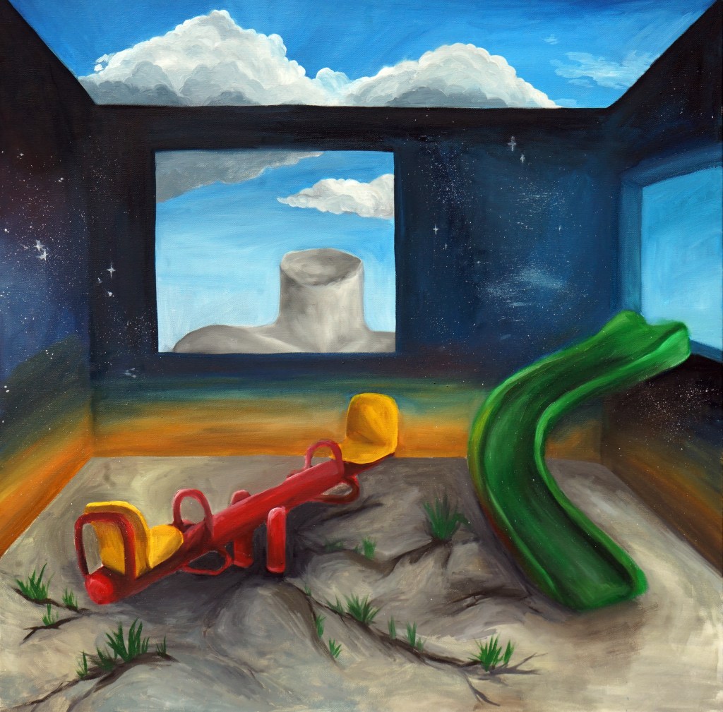
Inspired by Magritte, Ernst and Dali, this piece creates a surrealist environment that uses objects to depict the concept of “confined happiness”. This painting documents a transitional time period in my life which had involved moving schools and adapting to new environments. The contrast between light and dark environments brings the concept to life. The headless person in the window portrays a sense of feeling lost and lacking self-identity, while the playground equipment represent growth and detachment from childishness.
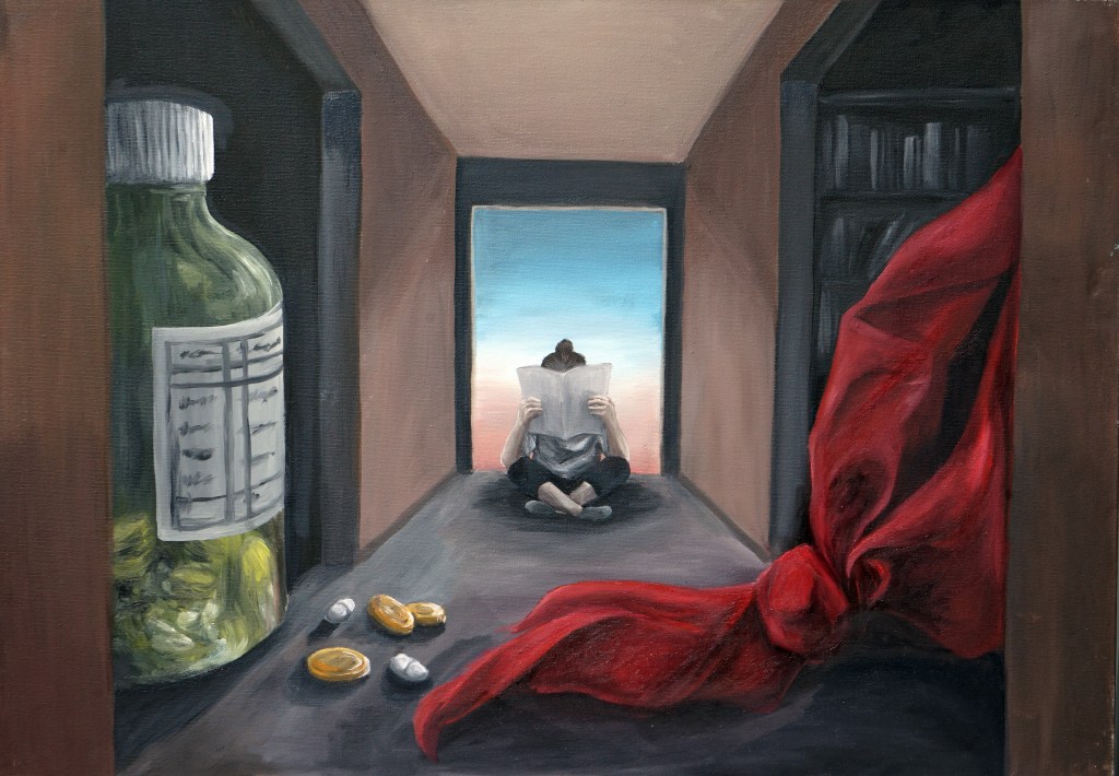
Influenced by René Magritte’s use of surrealism and depictions of indoor environments, this piece portrays the dilemma which my parents had to face when I was younger, which involved choosing between allowing me to attend school or hospitalization. The importance of this decision is emphasized through the abstractly large sizes of the pill bottle and the Chinese red scarf, as well as the overall composition of the piece which captures the influence of my health issues on my past.

Inspired by Eric Kennington’s use of pastel drawing techniques, I created a drawing of an underwater scene. This piece comments on how being near sighted had been the cause of my fear for swimming, as well as how we often feel disoriented when facing fear or unfamiliar situations. The glasses in the drawing symbolizes one’s attempt to understand the thoughts of those around them, while the diving girl represents my past self, who was someone who struggled to fit into certain social environments.
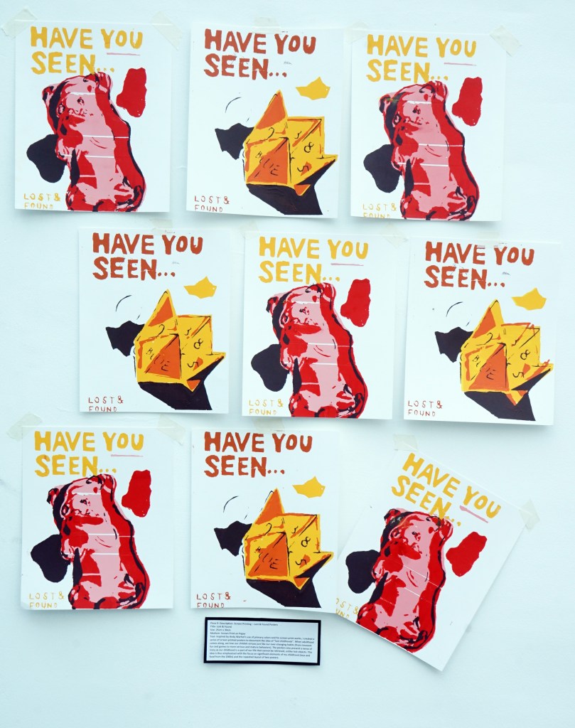
Inspired by Andy Warhol’s use of primary colors and his screen-print works, I created a series of screen printed posters to document the idea of “lost childhoods”. When adulthood comes along, we lose our childish virtues just like our ever-changing habits (from innocent fun and games to more serious and mature behaviors). The posters also present a sense of irony as our childhood is a part of our life that cannot be retrieved, unlike lost objects. This idea is thus emphasized with the focus on significant elements of my childhood (toys and food from the 2000s) and the repeated layout of two posters.
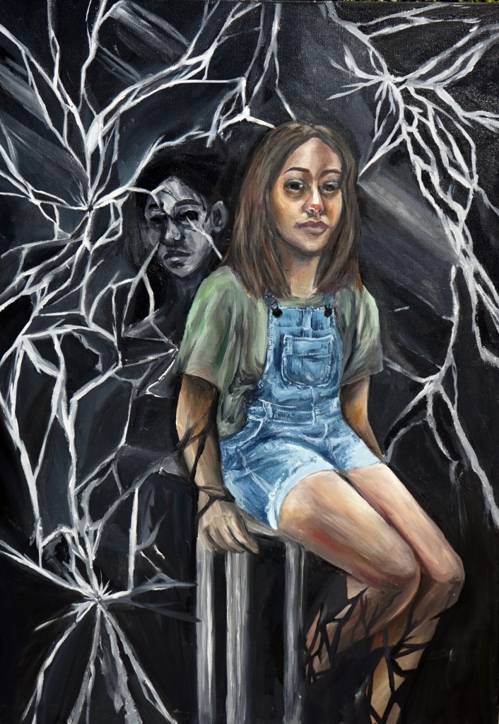
Inspired by Sylvia Gosse’s layering and portrait painting techniques, I created this piece to comment on individual growth and self-reflection. The main figure is placed in front of cracking mirrors to symbolize the difficulty of discovering one’s identity and how we may lose our true self due to constraints in our environment. The dark reflected figure behind the main figure is also a symbol of how we have hidden identities that are results of our past.
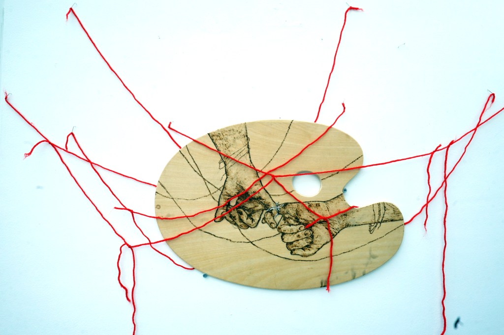
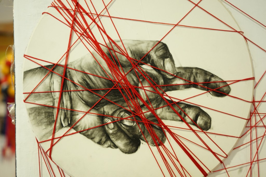
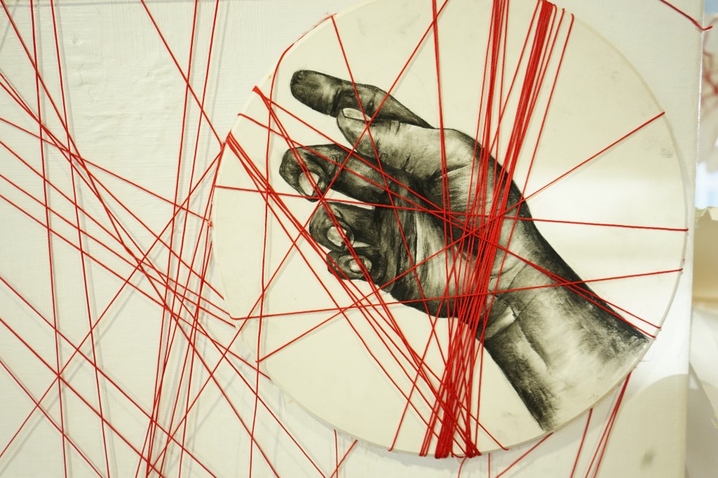
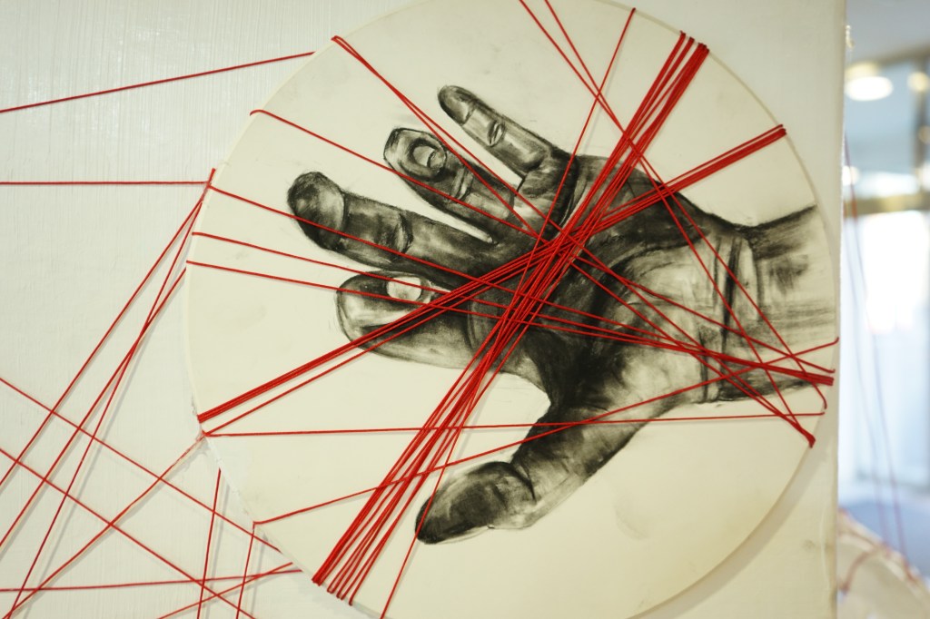
Inspired by Henry Moore, this mix media sculpture portrays the relationships and attachments that I have with my friends and family who are significantly important in my life. Burn marks are used to present the permanence of relationships, while the strings (both engraved and in physical form) depict the complexity of human interactions. I chose hands as a symbol of connection and interaction, and the palette represents how maintaining a relationship is similar to creating art.
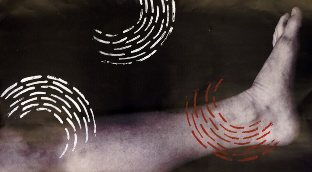
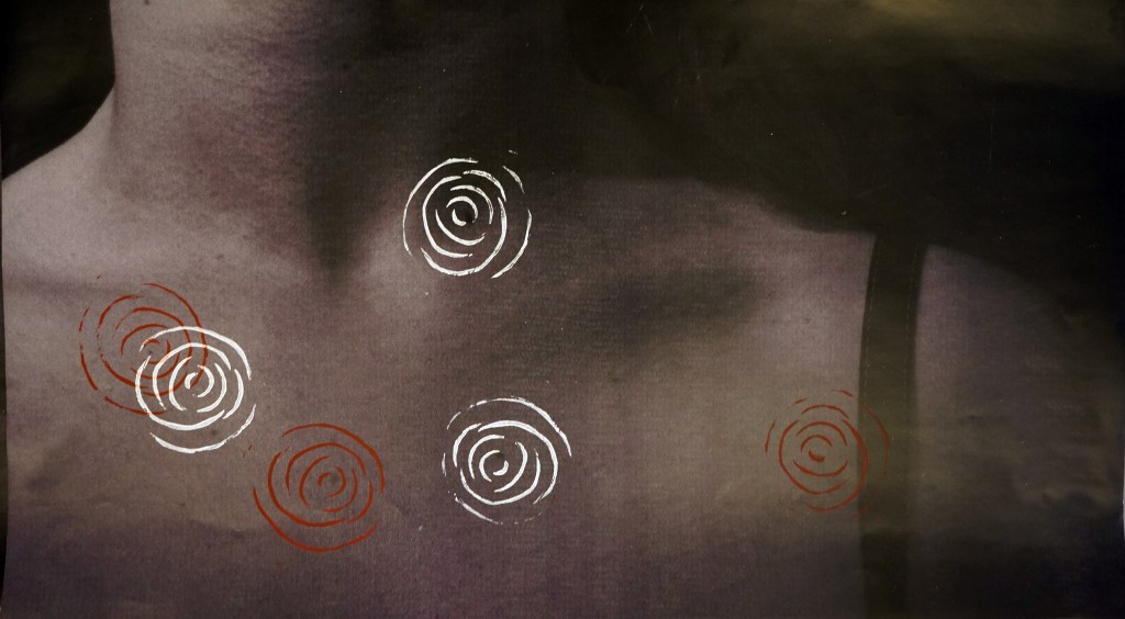


Inspired by Edward Weston’s black and white photography. I photographed women’s stretch marks, scars wrinkles, birthmarks and bruises. I then carved repeated patterns from Linoleum blocks to create prints that symbolize the marks as sign of beauty as it is commonly seen on all human bodies, just like prints on artworks and clothing. Each print is created with a close-up shot of a body mark and patterns to create a layering effect that constructs a focus on the beauty of flaws on the human body.
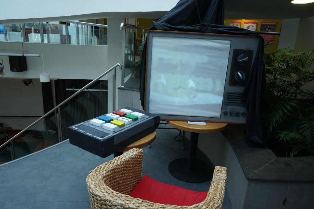
“Self. Control.“
Inspired by Mona Hatoum’s video art creations, this installation documents the complexity of human emotions and how we often lack control on how we feel. The TV represents how we often face situations in our life that seem impossible or unreal, and we look back at past events often in awe of our reactions, whereas the remote is a direct symbol of “control”. By documenting different individuals and creating a video with contrasting effects, the idea of “self” identity is paired with the facial expressions of each individual, which portrays the idea of how we may be identified and labeled by how we present ourselves, despite lacking control of our behaviors.
KATIE
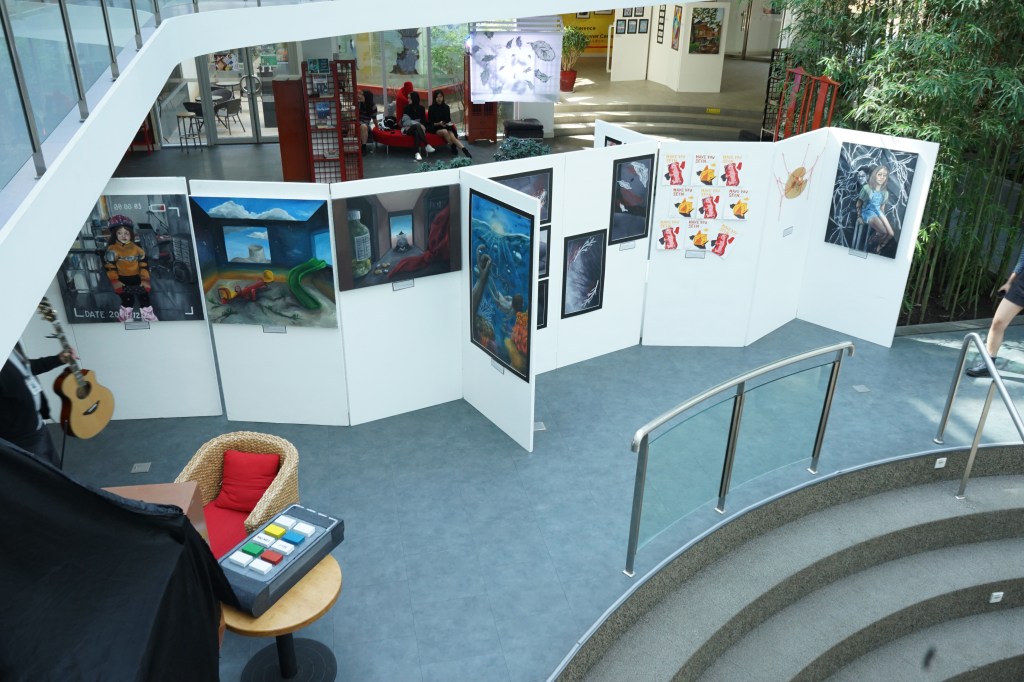
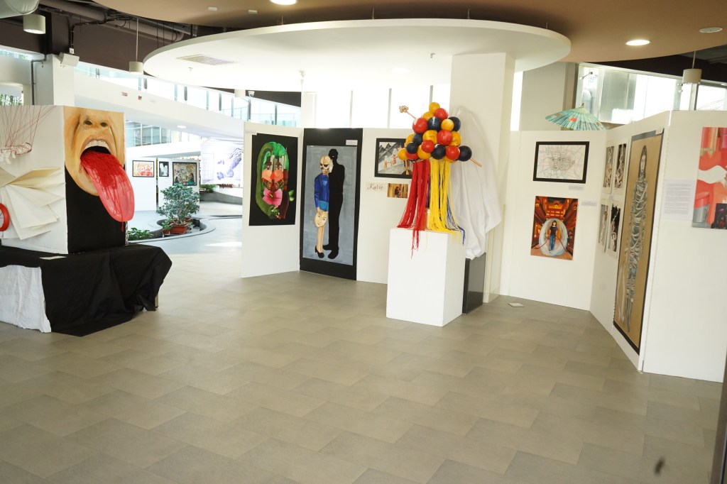
I have an exhibition space at the entrance of the school. I have 8 display panels and 2 sculpture blocks. Because of the location of my final sculpture, I need the viewer to see my work from right to left. My work looks at many themes, but they relate, making them coherent. As a group, all of my work is about me.
I start my exhibition with my painting “Identity My Mood.” It is hung at eye level because I want people to look in my eyes. In my next piece, “Other Standards, it is hung on a whole panel and is life sized. I hung it low enough that the viewer would be looking in my face. It can also be like a full size mirror where the viewer looks at the entire self.
My next 3 pieces are hung together as they look at areas of confusion. “Confusion” is a photo series and I hung them in two rows. The photos in the top row have ropes that exit the bottom of the pictures and look like they continue into the photos below them. It is like a single line passing between the photos. In “Who am I?” I also have lines and this looks good for the viewer seeing the lines in “Confusion” and then next to it, to see map lines. In addition, “Living in a Bubble” has the lines coming from the heart connecting the past, current and future. So, these three pieces “Confusion, “Who am I?” and “Living in a Bubble” all deal with confusion and let the viewer see the style of the line also connects the pieces.
On a sculpture block, I have my next piece, “Norigea 3D.” I also continue the lines and when the viewer steps back, they will see the colors of the sculpture are similar to the colors in “Living in a Bubble” and “Norigea 2D” (the piece the sculpture comes from). “Norigea 2D” and “Norigea 3D” xare both about Korean traditional jewelry, looking at my culture and my version of it. I originally thought to hang “Norigea 2D” first, but I changed my mind. I want the viewer to look at “Norigea 3D” and wonder what it is and how I thought of the idea. When they look at “Norigea 2D” on the panel next to it, they can understand what it is. I like having the viewer have questions and then giving them the answers.
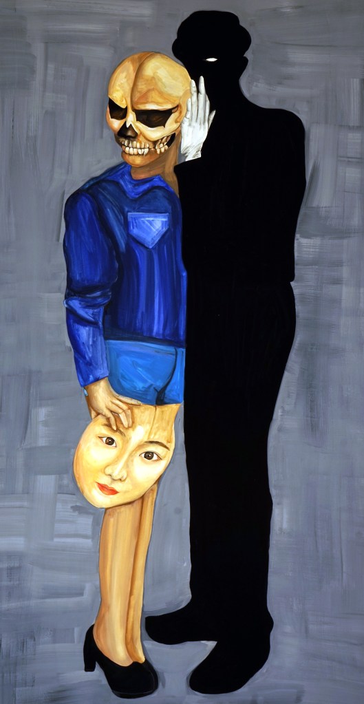
Next to “Norigea 2” I use a whole panel for “Skeleton.” In this piece I again look at Korea and standards of Beauty, but it is different because now I am looking at how people think of my cultural identity and beauty. I hung “I am Korean” next to “Skeleton” because they both talk about the same issue. People think because I am Asian, that I must be Chinese. I want to introduce myself as being Korean. In “Skeleton” My Asian face is in my hand. In “I am Korean” however, I use symbolic Korean objects to show my face.
Because my display panels must be folded on a right angle in order to stand, the viewer then goes to the back of the panel to see “Home,” a painting of traditional Korean buildings. It works that “I am Korean” has buildings and on the back of the panel, are more details in the buildings.
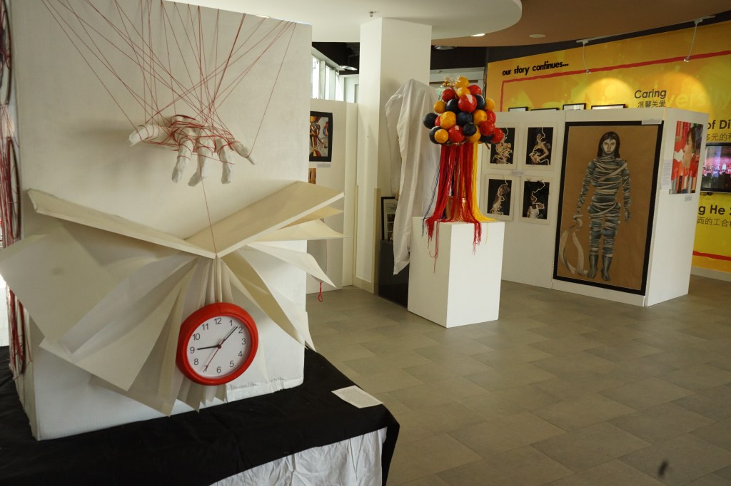
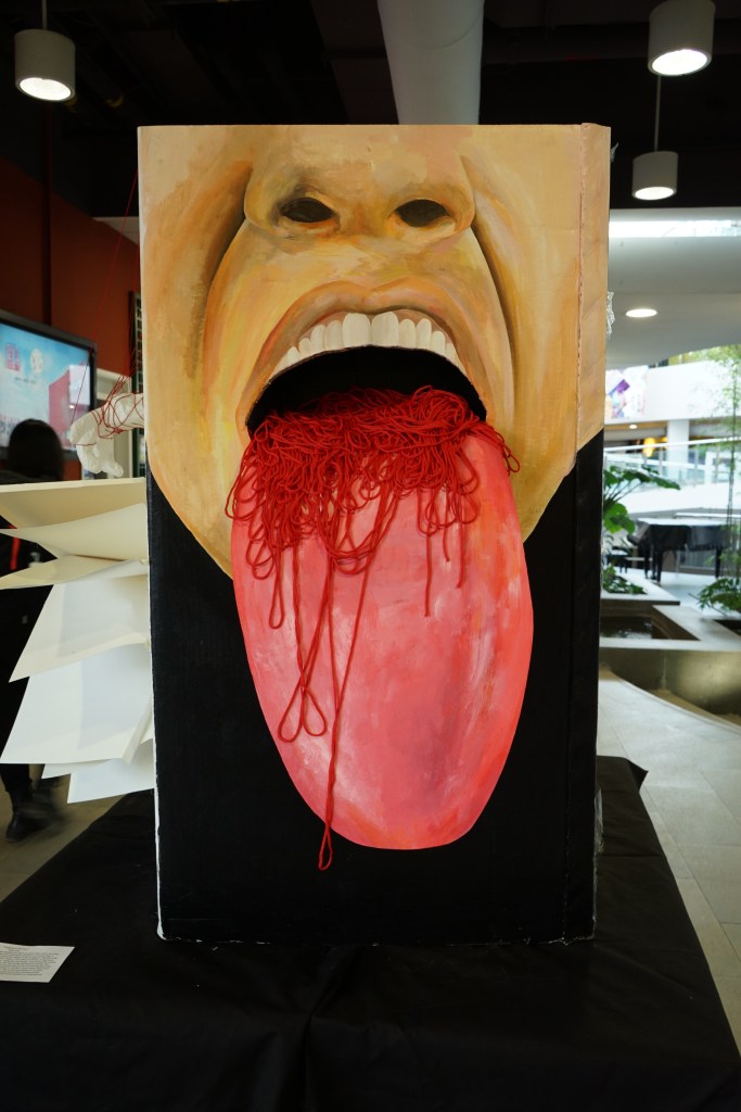
My final piece is “Trapped in the Box.” It is an installation that sits high off the ground, so that the viewer can look into the mouth, can look straight at the hand holding string and a clock, can look at the face of the person I painted trapped in the box and see the details of my hands wrapped in string. All of these are at eye level for the viewer. I also put a light in the box and yellow acrylic on the top. When the viewer looks up, they see yellow light hitting the ceiling. This symbolizes freedom in the future. It is placed in an area that lets the viewer have lots of space to walk around it.

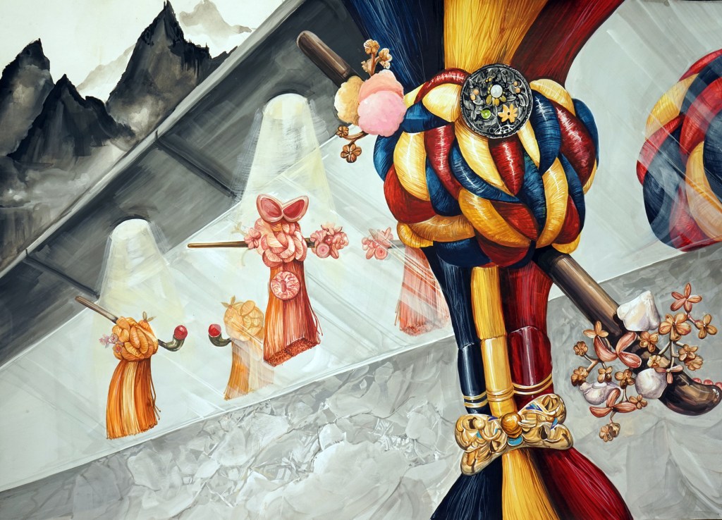
“I am Korean”
I have been inspired by Arcimboldo. I am Korean, but get mistaken for Chinese. All Asians are not Chinese and I value my Korean roots. In this self-portrait, I used symbolic Korean objects which include a dragon, rose of Sharon, Hanbok, Norigae, Korean style buildings, tiles and peaches. I have used complementary colors to complete this.
Inspired by Korean traditional pendants. I am constantly seeking my identity and who I am. I decorate myself with makeup and the clothes I wear, but “who am I?” I have drawn these pendants as living beings, symbolizing me. They are like me, they are seeking their identities as they glance in the mirror. I made Korean pendants in my own version to express that they (and I) are unique. The mountains in the corner are from traditional Korean ink painting, to symbolize my Korean culture.
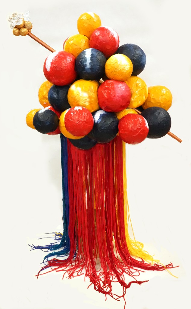
“ 노리개 3D”
Inspired by the way Dubuffet and Lichtenstein take their 2D art and make them 3D, I did the same. This is a 3D sculpture of my watercolor painting ‘노리개’. The red, blue and yellow spheres represent woman’s hair in a bun. I made her hair red, yellow and dark blue to symbolize colors from Korea. I made a hair piece similar to a Korean style going through the bun. I made the colors copper and gold to make it more elegant. The strings were taken from my watercolor painting ‘노리개’.
I was inspired by Xie Kun, I created a self-portrait based on my moods. i struggle with my English, so I use makeup to express myself and my feelings. Colors match moods. textures match moods. I show myself from a side view to get the viewer to wonder about my other side. I use lipstick and eyebrow pencils to symbolize the tools I use to decorate myself according to my mood. The right corner is full of shapes, textures and images in my brain. They show my confusion about who I am today.

“who am I?”
Inspired by Ed Fairborn. I lived in Korea, now in China, and in the future I will live in the United States. Living in various countries, I am confused about who I am. I drew the maps of Korea, China, and Manhattan. My face looks forward to the present, and my profile looks to the future. It represents my wandering, not knowing where to go. I color one map red, representing China. The blue map is Korean and the grey map is the U.S.A. I make it grey because I don’t know my future.
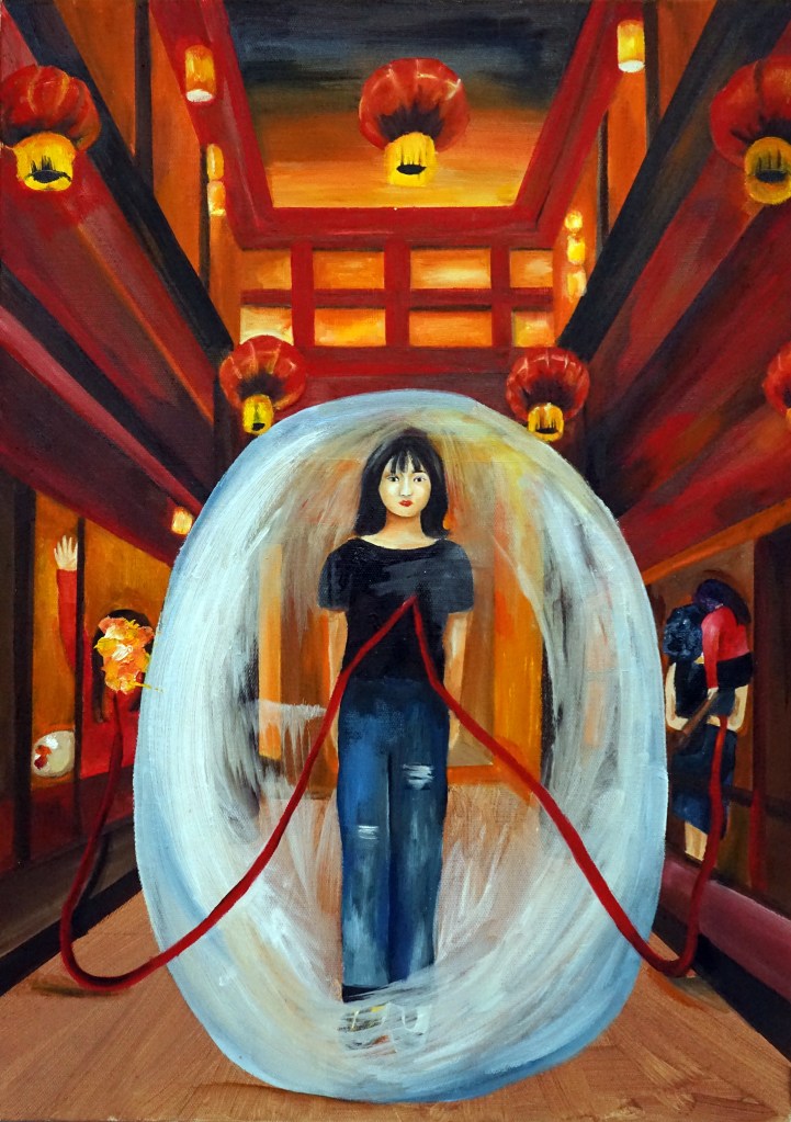
Inspired by Frida Kahlo, Paul Gauguin and Zhang Xiaogang. When I first went to China, I thought China was beautiful. However, when I moved here I saw it was dirty and old. I show me expressing joy at the left in the window (when I first came to China), and on the right I express my longing for life in Korea. In the center is me, trapped in a bubble to symbolize my original thoughts of Beijing. The red string from my heart connects to both memories to show I want to remember it all.
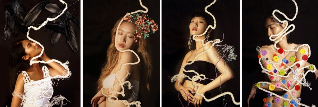
Inspired by Waldemar Strempler. My subjects are agonizing over the confusion of their identity. The rope expresses something they want, but which cannot be achieved. While the rope contours their body, it always goes across their neck, symbolizing being trapped and unable to move. The other materials represent their dreams. Feathers symbolize clothing and this girl wants to be a model but she is too short. The buttons represent suits and this model’s failure to be an actor in many roles.
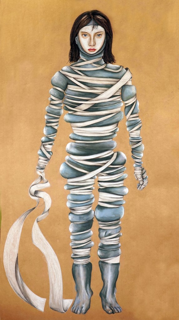
“Other’s standards”
Inspired by Zeng Fanzhi. Everyone else wants me to look like this. Koreans want women to have double eyelid surgery and my own mother wants me to be skinny. I drew a self portrait with grey skin to symbolize how I feel like my true self is dying. I wrapped my body in bandages to represent it squeezing me to make me skinny. I put a mask on and the mask has big eyes and a white face, which I don’t have. I don’t have a right hand because it is the hand I eat with. I can’t eat if I am skinny.
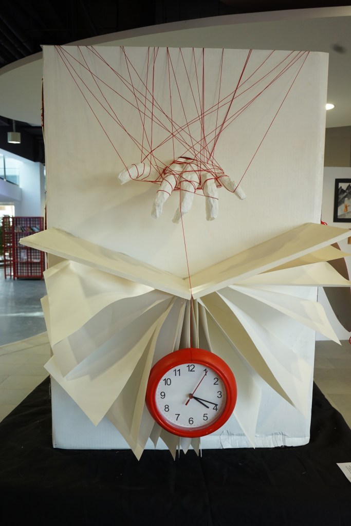

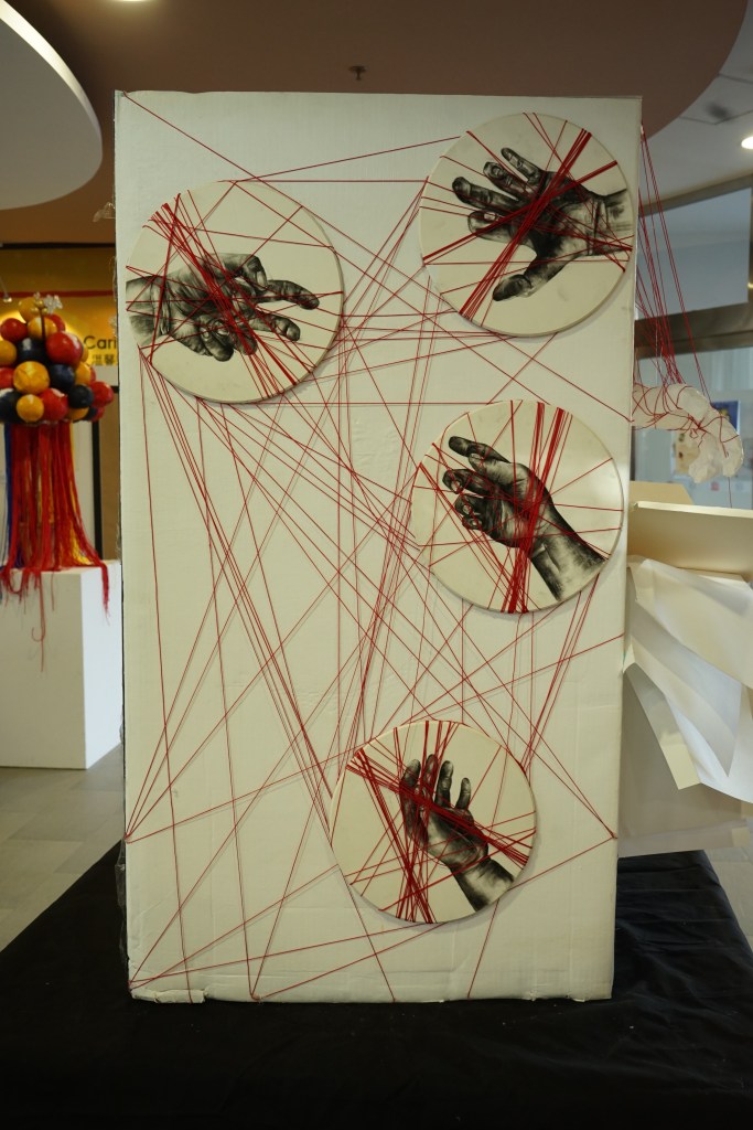
Inspired by Zhang Xiaogang. When people are want to what they want, but they cannot. To express it, I used the box and represent situations on each side. It mainly used red string, in which it means the reality to be accepted. The first side expressed my first appearance in China. When I first came to China, it was hard because of language, food and culture. Using the red string, I expressed the reality that I had to accept. On the second side, the red string tied several hands. The meaning of this expressed the reality that people want to do something that they can’t do because of their current. Third, people in modern times keep away from books because they are running out of time. This is also a problem in modern society. The last one expressed me wanting to get out of this situation(box). However, I still looks trapped. Top of the box, the word freedom is reflected by light. This means that get out of this problem.
Inspired by Damien Steven Hirst. I’m self-conscious as to what I sound like, look like. The shadow behind me expressed people’s gaze and behavior, and the person in front of shadow drew myself as a skeleton with the same shape as other people. Therefore, I lose my identity. I conscious of the eyes of others around me because we live in a world where people live together. I painted the problems with it and the grim reality of modern society, where it loses its own characteristics.
